Saturday, October 01, 2005
The Rings of Saturn
"Three or four miles south of Lowestoft the coastline curves gently into the land. From the footpath that runs along the grassy dunes and low cliffs one can see, at any time of the day or night and at any time of the year, as i have often found, all manner of tent-like shelters made of poles and cordage, sailcloth and oilskin, along the pebble beach. They are strung out in a long line on the margin of the sea, at regular intervals. It is as if the last stragglers of some nomadic people had settled there, at the outermost limit of the earth, in expectation of the miracle which would for since time immemorial, the miracle which justify all their erstwhile privations and wanderings."
The Rings of Saturn
W. G. Sebald.
1998, The Harvill Press
If one were to have bumped into W. G. Sebald on one of his walks through the towns and countryside of East Anglia, perhaps staring out to sea or up at the architecture of a stately home or leafing through the yellowed pages of antique manuscripts in a small out of the way museum, or rambling across fields to reach the birth place of Thomas Browne, one would be well advised to be cautious in what questions one might ask. He may seem as though he were passing time, wondering casually around in no definate direction, almost lost, but in reality he will be building a narrative so vast and full of the richness of time that you would more than likely be transported with him through the darkness and beauty of his historical details, to travel in your mind through a strange and dark historical world and then to land again upon the wet reclaimed Anglia soil with a completely different set of eyes.
Sebald makes time almost palpable to the hands. Every object that he focuses upon grows its own interlinked narrative. You realise that Sebald only appears to be walking across the Southwold sands, through the various towns and villages fixed to the eastern edges of Britain, he is in fact piecing together in his mind a country that doesn't exist on any map. He is expanding on his personal explorations into lost information that perhaps never was exactly as he tells them but instead only points towards a world that remains lost and mysterious. He Reminds us of the way the past satuarates everything in life. The architecture and physiology of the area achieve new significance as the intrepid Sebald leads us on his own personal historical tour, covering such unlikely subjects as silkworms, the herring industry, the history of country house landscaping, Conrad, Swinburne, Chateaubrand, evoking cultures past and present, weaving an intricate web that seduces the reader even along the most seemingly fruitless trails. In this mixture of fiction, Autobiography and essay writing Sebald reclaims his lost subjects from the drab and dishevelled present and uncovers the trajectory of their demise, unearthing the most unlikely treasures.
Saturday, April 23, 2005
The Death Ray
Eightball Comic by Dan Clowes
Issue 23 - 2004 - The Death Ray
The tale of Andy and his friend Louie two average school kids going through adolescence and how their lives change due to the special powers of the Ray gun. The story is illustrated in full colour and with typical Dan Clowes attention to detail. Through its forty two pages the characters lives are drawn out in all their complexity, their difficulties at school, their family problems, girlfriends etc. Clowes intricate dialogue draws you into the narrative. It has the feel of a Graphic novel in length and depth. The comic is large format, about a half inch bigger than A4.
The two boys are faced with the dilemma of what to use the gun for. They are amazed at the beginning by the guns ability to make everything disappear and excited at the prospect of getting rid of everything they don't like. However they soon realise that they need to hold back their instinct to play with this powerful tool and that killing people is a serious business even though made easy by the Ray gun. They develop principles and rules to justify their killings like detectives or superheroes in books and on TV. Andy is imaged wearing a Superman outfit while carrying out his attacks, doing it for the ‘good of America’, he builds justifications into his actions; protecting the American way of life. Their detective work is based on their own personal opinions and ideas about people they know and this leads them to getting rid of people for the pettiest of crimes.
Only Andy can actually work the gun and Louie just goads him along with his aggressive, paranoid behaviour. Until, that is, Louie starts believing that he himself could be a victim of the Ray gun if one day Andy decided that he didn't like him and Pow! he would be dead like the rest. This idea of Louie’s makes him confront Andy and this draws the conclusion to the story which involves a clever twist. In some ways it seems like a coming of age story with Andy finding out about responsibility and the limits of his own abilities. Also reading it you feel that Andy doesn't really ever become a superhero of his dreams and the happenings are presented as really quite sordid. Andy and Louie, with the aid of the Gun, allow themselves to be drawn into a real life comic super hero’s experience and find out that there are more grey tones in real life than in the black and white comic books.
They get mixed up in trying to sort out the complications of life with friends and family without really knowing what is going on. They try to police the streets at night, protecting old ladies. Andy never really overcomes his own innate personality traits. He may have this new found power but in the end he is still Andy with all his weaknesses. It doesn't matter how much power someone develops for themselves they are still them, with all their insecurities. An analogy could be made with America which has so much dominating power over the rest of the countries of the world but in the end is still America with all its right wing paranoid foreign policies and ideals about enforcing Americanism and ‘democracy’ to problem countries.
Andy and Louie are portrayed in the comic almost like the male equivalent of the 'Ghost world' Girls in Clowes previous Comic. The drawing is in his signature retro 1950's style and the exaggeration in the characters is held back to give the story an every day feel. Tonal differences and a clever use of titling in between the panels splits the story up and gives it 'chapters' that space the story out and separate the different scenes. This also allows for large amounts of time to pass from one scent to the next so that the comic manages to encompass Andy's life from adolescence to middle age. This gives the reader a real sense of how events effect a persons life and gives Andy time for reflection on his past.
Tuesday, February 01, 2005
Raw Materials
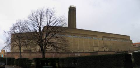
Tate Modern Building, Southwark Tube Station, London
Bruce Nauman - Raw Materials
Sound Installation at the Tate Modern Gallery
The Turbine Hall, a unique gallery space previously exhibiting large sculptures specifically made for this old refurbished factory interior. I walk up the steps of the nearby tube station and make my way through the back streets using the Tate signs posted along the way. Under dark black 19th Century tunnels and past small café’s resurrected or sprouting out due to their new proximity to an Art establishment. Amongst the fabricated angular structures which form an anonymous mass all around this area I spot the gallery tower rising. Faded industrial signs melt into the dirty red brick walls that I walk past as I near the back of the Tate building. The sharp rigid transparent structural additions to the architecture can be detected. Millions of factory workers milling around in there.
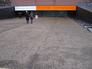
I walked down the slope towards the row of grey doors and entered a large reception space. The unreal size of this area with the industrial crane above. As soon as I stepped through the door I was immediately surrounded on all sides with sounds of conversation. An abnormal number of people in this cathedral like space for passage into and out of the Tate. Not rushing to get anywhere or walking quickly past anything. Standing, wandering and smiling in recognition of the tone and texture of voices repeating there internal corrospondence. Instead of walking thoughtlessly to the inside entrance to buy books from the Tate shop or travel the elevator to the gallery area, people were now dawdling about, starting to walk then stopping to listen to different bits. To the dissonancy of sound directed from the side walls of this long and high hallway. Shouting ‘work..work…work…!’ or another sound of an assertive child: ‘you want to be here… you may..want to be here.. you may want…’the child getting angry. With the work..work shouting in the background. The cross over of voices resembles an asylum of incoherent individual sounds fixed by the rectangular speakers layed flat against the side walls at regular intervals. Sweeping out and overlapping, filling the world of the Turbine hall and surrounding the unsuspecting public.
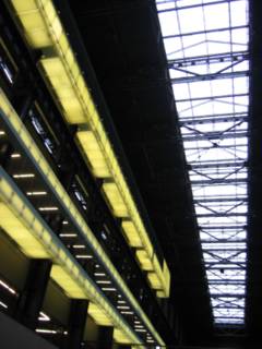
The space where people have to go through. To walk about fifty yards through this Liverpool St. train station sized space. The voices are not casual. They are mostly insistent and unhesitatingly direct. People put there ears to the sound, close up to the speaker. They could stand away and still listen but they feel the need to block out the other surrounding speaker voices, the ones telling them to listen that way not this way.

When standing in the middle the mind can focus on certain sounds and block out others. Why block out one and not the other? Get rid of that threatening voice over there. Listen to that polite child that is quite incoherent when listened to? Because the voices are dislocated from their original context, they seem abstract and although familiar in their use of language this fragments as the various sounds overlap in the space. The initial brief understanding of the vocal sound breaks down and you begin then to notice the intonation and pitch of the sound. Especially in relation to other sounds in the space. In their abstract nature they become like three dimensional presences filling the space. A presence like that of surveillance cameras in supermarkets.
The voices claim a hold over the passers by: The thrill of being told what to do or conversed with by a stranger. Listening through a wall at something we cannot see. Of turning the knob on the radio and listening to the fragmented parts of different dialogue. The strangeness of watching others listening, with them not just standing and looking but moving around the room to gain different experiences of the sound. There is something novel about using the ears instead of the eyes. The nearest a gallery would come to haveing a concert and having that group experience.
We make up our own logic. I find myself discriminating for comforts sake. My feelings change and I want to listen to the aggressive shouting for a while and smile at the other softer sounds creeping in from the distance. I am creating my own composition.
The speakers are placed every ten yards and are normal speaker black fixed into the black iron support structures on the walls. A part of the structure. A part of the Tate Modern structure. A part of the Art institution. The sounds have authority placed in art institution foyer. When listening am I listening to the Tate Modern? The space is playful in that it encourages people to create their own sound organisation. People to be seen moving around the vast space to indulge in the nuances of sound difference between standing over here or over there. One child not embarrassed to lye face up, flat against the ground, trying out a different sound experience.
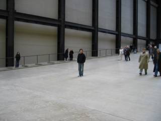
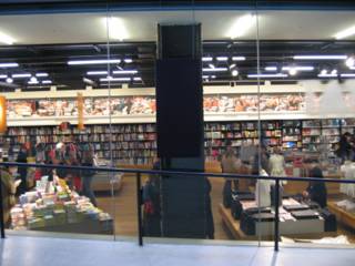
I took photos. Trying to capture people listening, if that could be visually captured. The smiles on faces. The odd laugh. Some standing in the middle as if they are on top of a mountain. The further down towards the sounds at the foot of the slope. The sounds creating a different feeling of perspective. I saw people pushing their ears against the speakers. I lifted my digital camera and then they spotted me and were gone. That hypersensitivity of the art gallery goer there displaying itself. Showing a shyness for the camera even though I concealed it well and turned as quickly as I could, pretending to take a picture of the window into the bookshop.
What would have happened if Bruce Nauman were to have placed the speakers outside of the gallery altogether. In the city where they would interfere more with the environment. People would be forced to listen to it. It would irritate their busy minds in a hurry to get from A to B. In the gallery people can drop their other thoughts legitimately and feel that they should give time to the artwork. They expect the illogical. They want novelty. In the street there is no time. There are too many norms to fill out. A group of people may walk past and caste a snide remark if catching you crouching to listen to a sound coming from a post box or a road drain. The Tate is safe. Only recently in history has interaction formed one of the rules of Exhibited art. It takes it from the street and enables us to experience it in safety.
The dissonant sounds heard in the Nauman exhibition are very similar to sounds heard in the outside world. The sounds that we often hear fragments of and form a confused background to our thoughts. We have no time to investigate them and really we don’t want to or we are not allowed to do so for fear of punishment. Nauman has taped them and placed them in order inside the closed doors of an institution for us to analyse. The tone of voice, the rhythm of words, the knocking together of opposites and incoherent sounds with no known reason. Rather like over hearing the sounds of people talking in a London tube station at rush hour. This exhibition, I think, enables people to work out their own mind impulses and workings. How the subconscious mind works. Organising information for us and sectioning it off. We then drive it on to find logic or meaning even if the origins are fragmented and incongruous.
The raw materials that Nuaman has placed here from outside, turn into abstract audio presences that generate a new life inside the hall, a presence. They do in reality fuse with the surrounding space as if moulded by it. We put on this space like a cloak as we walk through the entrance doors. It surrounds us on all sides and fits into every corner of the space. Then we have a conversation with it that leads us in all directions. Listening to the mad chantings and foriegn utterings.
There is a clever piece of Flash animation at the Tate Modern website which gives an idea of the sounds at the hall. In this case there is not substitute for actual experience. The sound has to be listened to with all of the site specific interactive elements intact. Why not go, be a guinea pig.
Monday, January 31, 2005
Nosferatu
 |
Directed By F.W.Marnau 1922
Costume and sets by Albin Grau
Photography: F.A.Wagner
Music: James Bernard
Adapted by Henrik Galeen
Count Orlok: Max Schreck
After the novel ‘Dracula’ by Bram Stoker
The film begins with a view down upon the city of Wisberg and it’s German gothic church tower as if seen from the heavens. The film then cuts to scenes introducing a newly wed couple in their married bliss: Property Salesman Hutter and his wife Ellen who live in Wisberg. Hutter is sent to Transylvania by his eccentric estate agent manager Knock to visit Count Orlok who is interested in buying property in Wisberg. Knock is mesmerised by the strange hieroglyphic language of the letter from Count Orlok.
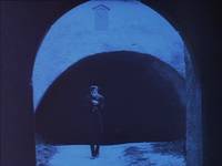
Hutter travels to the Counts' castle in the Carpathian Mountains, crossing the bridge that acts as the gateway into the gothic fantasy land that surrounds Count Orloks’ castle. Inside this dreamlike place space and time are altered to form a strange surreal landscape. Murnau makes the most of the limited special effects available to him on this low budget film to create disturbing alterations in film speed and changes in the look of the forest that Hutter is driven through. The Count, when meeting Hutter, becomes fixated with the image of Ellen, Hutters wife, as seen on the neck chain that Hutter wears around his neck. Thus begins the bizarre fated romance that sends Count Orlok travelling across land and sea to Wisberg.
Hutter is pictured as a fairly happy-go-lucky character who contrasts the intense figure of the count existing in his own dark world, rising from his coffin and creeping out into the shadows at dusk. There are intercuts showing Hutters wife Ellen who becomes ill during Hutters time away. At around the time Count Orlok becomes entranced by the image of her on Hutters neck chain, she hears the cry of 'Nosferatu' in the sky.
The Film tells the story with the aid documents dating back to ‘The Great Plague of Wisberg of 1938’. Throughout the film a collage of texts from historical books are used to support the silent visual telling of the story. This in conjunction with information about vampires and in particular the type of vampire called Nosferatu. Notes are used instead of imagery or speech to inform us of signs of the presence of Nosferatu. This allows time for the camera to dwell upon graphic imagery of Nosferatu himself in all his aesthetic and mythic Strangness. The figure of Nosferatu embodies the extreme fear of death that existed at that time. Fear of the Black Death of 1938 and of the Flu epidemic which was then attacking Europe between the wars, killing as many people as in the previous First World War.
 |  |  |
The Director F.W. Murnau and the costume and set designer Albin Grau created the figure of Nosferatu based on the original book ‘Count Dracula’ by Bram Stoker. This is not the lounge lizard of tradition though, a dangerous but handsome villain charming his female guests into false confidence. Murnau's Nosferatu takes on the appearance of a rat creature in human form, hiding in a soil filled, rat infested coffin in the basement of the ship ‘Enthusa’, travelling towards his unsuspecting female prey. The soil is said to be from the Fields of the dead that sustain Nosferatu and give him his powers. Perhaps from the fields of the recent first world war dead or the mass graves of the plague victims.
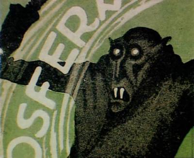
The Beast Nosferatu
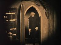
Max Schreck’s Count Orlok is exaggerated in its theatrical mannerisms and reaches beyond the real world and into the world of the Surreal fantasy and nightmare. Schreck casts his figure with the sharpness and clarity of a German woodcut against the walls of Hutters house. Murnau’s Nosferatu is a walking piece of art. A craft built from association with vermin and other creatures of the dark. The humped backed figure of the Count, his wing like arms folded inwards, hands elongated like rats feet.
The Count does do not rush around as if in an action movie but walks delicately with quick short strides, striking poses. Nosferatu frames himself in the rising arches of the gothic architecture around about him, bathed in the shadows of the night that symbolise the nightmare from whence he has come. The famous scene where Nosferatu steps slowly up the staircase, his shadow caste before him, illustrates the coming of the darkness, of the nightmare, of death. It seems to be the very night itself that strikes fear.
The figure of the Count exists on a par with the minotaur of Greek legend in his vast concrete castle structure, half beast, half man, searching for his prey. With his magic he can lift hatches, move about super fast and raise himself out of coffins without hands. This is evidence of his powers. Because of these powers, visualised by use of early stop motion camera trickery, we believe that the Count has the unseen powers to influence events in Wisberg on his arrival. He embodies the evil powers that engulf the town in the fear and misery of the Black Death. The analogy made in the film between Nosferatu’s presence and that of The Black death strengthens the impact of the scenes.
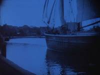
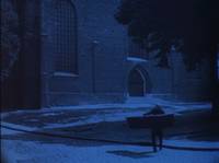
The flea infested rats that are carried with the Counts ship run out onto the harbour when the basement hatch is lifted in the schooner after it drifts into harbour. The sail of the schooner knocks out of sight the church tower (the main symbol of religious belief existent in the town) as it drifts silently and crewless into harbour creating an eerie and godless atmosphere.
 |  |  |
Nosferatu as the Raven, rodent, human form acting without mercy, without reason is seen to embody the undiscriminating horrors of the deathly virus. The dark forces of nature at hand are illustrated by films of a preying mantis plant trapping a fly and a spider in its web crawling towards its catch. By some chance of fate Helen has landed in a web and the arched back and thin black legs of Nosferatu are creeping towards her.
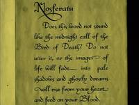
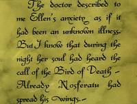
Walking awkwardly like a bird on land, the Count castes a dark spindly figure as he carries the coffin of soil in his arms across the harbour, towards the derelict structure of his newly acquired house. His sharp footsteps remind one of a bird of prey. There are direct references throughout the film of Nosferatu as a winged assassin. A bird like creature that makes the cry of Nosferatu to it’s victims. It is written in the gothic hand of the book of vampires. This is the midnight call of the bird of death and his cry is heard by victims shortly before being devoured. The wings of evil have flown into town.
 |  |  |
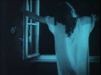
Ellen at the window
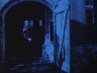
The Count is at the window opposite the bed ridden Ellen. She is lured from the bed to the window. Her arms outstretched, she is drawn to open the window. The Count stands looking through at the opposite building seeing Ellen in the flesh now for the first time, peering longingly through the window frames, hands touching the Paine.
Like a scene from Romeo and Juliet they face each other across the street. An intense love affair. A fatal attraction. The soundless space between them. Ellen flails about hand on heart in suffering silence as Hutter lies asleep on a chair in the same room. The Count freezes into an animal like pose ready to strike. He walks woodenly away from the window. Ellens’ fate is treading towards her. The Count magically opens the barn doors of his building enabling him to keep his pose as he slowly steps towards the house opposite.
 |  |  |
Art
A German gothic romantic world of striking pointed arched forms and contrasting blacks and white tones, reminiscent of German expressionist woodcuts, the image novels of Frans Masereel.
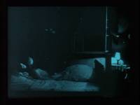
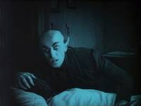
The scene near the end where Count Orlok is crouching by his victim is contructed very much like the Swiss painter Henry Fuseli’s ‘The Nightmare’ which depicts a woman in the middle of a terrifying dream. A grotesque figure perched on her chest signifying her torment. Orlock's striking bald headed features and the pointed ears seem to be influenced by this earlier image. Nosferatu is ‘The Nightmare’.
 |  |  |
Text
There is relatively little spoken words throughout the film. All words work as aids to serve the collage of imagery jumping from one scroll of text to a short scene to speech text to an excerpt from a book. The various scrolls and texts taken from the original Dracula story are placed as if to read out in the theatre. The music to the film would have originally been played to the audience live before the projected film. Each performance at the time of it’s making could produce a slightly different experience. The props and artefacts are added to by the projection of coloured light behind the negative during production to signify daytime and night time. The theatrical set has been replaced by actual real landscape, Nosferatu walks off the stage and into fields, free to wander the world and find his victim. This was unusual at the time as most productions of this type were staged indoors. The real life backdrops give Nosferatu a more menacing existance, cut alongside scenes such as the funeral march through the main street in Wisberg.

Murneu presents the film as a result of research into historical events collaging different types of documentation to give credence to the story. The original Vampire books use of a collage the documentation to tell the story is again used in the film cut in between the different scenes. Apart from being just informative this devise also grounds the events in reality. The act of reading from the screen draws the viewer in and makes them interact with the narrative and is a more involving process. It is a film that could easily be read as a storyboard or graphic novel layout. Much attention has been given to the design of the inter-titles, sets and costumes, bringing them together to create a carefully crafted flow of imagery and a strong overall graphic look to the film.
 |  |  |
Colouring
For those who have long admired the completely black and white version of Nosferatu this new ‘completely restored’ edition could course a shock to the system. After the first few edits and text sequences you’d get used to the tints, that are actually back lit during the film making process. They don't distract from the story or the visual experience. Visually they seem to place the film more within the horror Genre. The colours could be viewed as typical of the dramatised horror of a theatre production or a freak circus show and away from the more familiar purity of black and white. Once you get used to the colour it does give the film more structure. F. W. Murnau did apparently make notes alluding to the use of colour in the film noting where the black and white should be left in. It seems strange that directors films, once made were then so open to the decisions of the manufacturers and picture houses. Murnau apparently left it up to the printer to decide on where a majority of the colouring went on the film.
The colour tinting used in this print has been coded Blue for night time and yellow for daytime. Without the tinting the vampire would still be walking around in daylight. The whole story of the film is based around the fact that Nosferatu will die if he is not in his coffin when the cock crows and the sun rises. Also the extreme black and white shadows following Count Orlok around could have been left so stark, as in the previous version, with the knowledge that these were the areas that would be tinted later in the process.
Experimental Techniques
For it’s time this film was highly experimental, using many different techniques to evoke the paranormal such as the use of one-stop animation where the vampire has the powers to lift doors and move things about the room. He also has the powers to move at incredible speed as shown in the coffin construction scene in the castle. As Hutter is being driven by coach and horses through the forest he travels at ‘frightening speed’ and the trees turn from black to white (using reverse negatives) to emphasise the unreal and dreamlike landscape he has entered after crossing the bridge into the land surrounding Count Orlok’s castle. A place where his guides will not go any further. In the original script for the film apparently there was to be a giant Raven standing by watching the coach as it went by. Also in the castle there was to be hands coming from the walls holding up candles. Supporting the idea that Murnua was attempting to visualise nosferatu as living in a dreamlike surreal world.
Albin Grau is credited for designing not just the costumes in the film but also the posters (pictured at the top of page) and the calligraphy for the inter-titles, giving the film the overall graphic feel that it has. Understanding the film as the piece of art that it is, with the obvious emphasis on the graphic black an white look of the imagery it is impossible for a third party to add anything and not distract slightly from the intentions of the original makers. The speech inter-titles are both over coloured and do not reach the exquisite style of the original. They give parts of the film a slight gaudy look. They distract from the scenes a little and would be preferred a couple of shades lighter or lower contrast with the black in keeping with the other titles.
The score is created by James Bernard who scored the Hammer films. He uses the syllables of the name Nosferatu as a theme running through out the film. The chanting of Nos-fe-ra-tu reaches different levels of pitch at different parts of the film. The sub-title of Nosferatu as ‘A Symphony of Horrors’ is matched here by an oral symphony running throughout the film. The orchestral sound rises and lowers throughout the film and greatly adds to the sense of forboding and suspense in the scenes.
Thursday, January 06, 2005
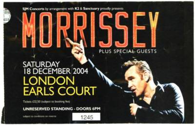
Morrissey Concert
Getting to the venue was a trial as I had forgotten where precisely Earls Court was. I thought it was opposite Earls Court tube station but having arrived at this spot found, by information given to me by a kind Londoner that I had come over to the wrong entrance and the polite and very articulate young lady gave me very precise directions to the site. My overpriced ticket was not going to go to waste. Coming out of this logical set of directions there it was, a shapeless mass looming up unremarkably before me. How far did it go back I thought, already counting the seat and the potential crowd size. As if I could tell the importance of the concert by numbers.
To the left of the venue a large advert for Morrissey’s ‘You are the Quarry’ album spanned the length of the wall. A twenty foot tall image of Morrissey, machine gun in hand, looking out on the passers by in the road. Men in fluorescent jackets patrolled the front checking tickets and giving advice to the slow stream of fans who had come about two hours early. Doors opened at 6.00. I decided to go get something to eat and come back. There didn’t seem to be enough people there to threaten my place in the queue.

Coming back from a tasty salad from Tesco, eating it friezing on the bench outside by the roaring traffic, I walked around the side of the building following the signs. I noted the line next to the standing entrance and joined it. It was a small line with only about a couple of hundred people in it. Ranging from people with ‘Moza’ shaved into their hair to 40 something’s standing patiently waiting. The young fans, a couple standing behind me, one with a Smiths T-shirt on who looked too young to have been around when they were playing. The two of them kept rattling on about how many Smiths songs there would be in the concert. Celebrating their knowledge of the back catalogue and trying to think of which concert they’d been to where Morrissey had sung the most Smiths songs: ‘He gotta sing at least three tonight, He sang five in Manchester’. Of course the Smiths legacy has stayed healthy due to nothing else really taking it’s place. In fact there has been a turn away from the alternative creative singer song writer bands towards an industrially manufactured wasteland of pop idols and celebrity culture.
Standing in a line for an hour in the freezing cold: Why did I come here? I hope this is worth it. Not having been to an M gig before I didn’t really know what to expect. I did feel strangely at home with people in the queue. There was a good atmosphere I thought, people had travelled down from The North, Birmingham, Manchester, Leeds, from what I could gather listening in to bits of conversation around me.
By the time they started letting people in there was a decent line but no more than about five hundred people? Walking into the huge interior of Earls Court gave me a disorientated feeling. Looking up at the ceilings of this huge bubble of a space, about 100 ft high. And here were the motley crew of fans lining the front of the stage. The small village hall of greying supporters dwarfed by the aircraft hanger like structure. I stood there worrying I was going to be stuck here cheering bands with the cold draft hitting the back of me and tumble weed skipping past. As the first support band came on there was still just a scattering of people in the place. It dawned on me that this could be a very maudlin affair. After all M had what was essentially a cult following. How could he possibly fill a venue like this. How could 45 year old Morrissey, not brought an album out in six years, fill a stadium this size?

The support act, in fact both support acts were not worthy of commenting on. They didn’t set up any kind of expectancy for the main act. In fact I was trying to maintain cheer that at least it was an interesting day out in London (although an expensive one). The irritated crowd started shouting semi coherent insults in the vague direction of the band. Finally the last of the bands crawled off (Is this Morrissey’s taste in music? James Maker?) Then we had to endure 45 minutes of men tuning rows of guitars and shimmying up to fix lighting and moving the set a round (probably to Morrissey’s precise request). The men sit on top of the roofof the stage and rain spotlights down like anti-aircraft guns.
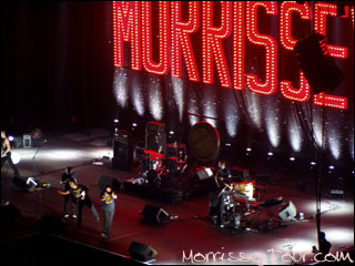
My feet aching already, I passed the time by watching the people: Asian Morrissey fans were really by far the most stylish of the lot. Their brown skin seeming to tone down the Morrissey quaff hair complemented by light brown shirt and brown jacket, all brown? There was a growing tension amongst the crowd. The electric set turned on. First the Las Vegas Morrissey lights came on suddenly to a cheering crowd. A list of complaints about English working class history was read out on the loud speakers. Apparently a name to this ‘song’ I don't know. It sounded like a sermon, purposely customised for a British crowd? A bit corny maybe but what concert do you go to these days where you get a rant about Thatcherism, Miners strike, Blair, Gulf war etc, etc. However it did create a certain kind of atmosphere.
And then Elvis-Morrissey comes out and around to the front of the stage together with his crew/band lining up together and bowing, all in one quick movement. M going to the mike and saying "Why do you come here?" looking around at the stadium. By this time I was in the show and had crossed the line from distanced, perhaps sceptical, bystander to potential regressive teenage fanatical crazy person jumping with the crowd. Due to there not being a coat room in the place (so I was told by a fluorescent jacketed person standing by the set) I was still in my coat whereas other people I could see around about me seemed miraculously to have developed light wearing t-shirts? The coat didn’t seem to effect me though it did make me stand out some what. A thick winter black Ski Jacket in an indoor concert where you were supposed to dehydrate and stuff and be carried off after fainting due to the heat! Being tall my upper half was quite cool and that must have kept me from not warming up too much. I will spare you the details of coat technology but it can keep you cool as well as warm depending on the temperature.
Morrissey was wearing his vicars outfit, dogs collar and all. Him giving a sermon to his church goers (who have forgiven Jesus) and forming a spiritual leader to guide them. The skewed Guitar intro and drums of ‘How soon is now’ thundered into action and the crowd start jumping and shouting the words, one person right in my ear but it didn’t matter, I just pushed him out of the way. Of course the catholic M is casting himself as an anti-hero, cloaking himself in order to obscure his identity and caste verbal stones at himself. The microphone lead he lashes behind his back and on the floor. While singing to the lush sounds created by his new band (Mozza Crew, that’s what it said on their t-shirts: I bet M insisted on printing them himself?). Morrissey's vocals had never sounded better and transformed the songs to a new level, adding to this his mime acting to the emotional highs and lows. Adeptly orchestrating the crowd and creating an intriguing repertoire of movements about himself.
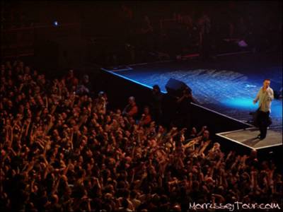
The crowd, all eyes honed on Morrissey’s person. He, gesturing and doing some physical theatre stunts and rolling about on the stage. At one point a man flung himself over the crowd from twenty feet back, being carried over by lofted hands, scrambling legs with arms flailing. M seeing this reached over and touched his hand. The young girls next to me or down below me and sinking into the darkness of the crowd saw this and decided that it was their moment and launched themselves as well. First one then the other over the back of the man in front of them in a crazy mad scrap to the front of the stage. Screaming out to Morrissey and disappearing into the arms of a fluorescent bouncer person. Not before attempting to throw what looked like her underwear on the stage. They just about failed to grasp the edge of the stage and fell down. What a waste and no Morrissey hand touching! What a sorry ending after all that effort. I hope she didn't miss the rest of the concert.
I considered throwing myself over but I imagined myself needing a strong crowd of supporters to hold me up and perhaps I would be sent outwards towards the dark being passed along silently with ‘Every Day is Like Sunday’ (Which he didn’t sing) echoing in the air. Out towards the exit and having to push my way to the front of the crowd again! He played ‘First Of The Gang To Die’ and the waves of the crowd pushed against the stage, people falling and swaying like wheat in a windy field. The singing fans knowing every word. Irish Blood, English Heart brought the whole arena to life and at the end the crowd gave such a chorus of screeching that I’m sure I noticed Morrissey stumble back and glance at his band members. Was he expecting that?

This in an example of the good humoured crowd around me: A girl taps a man on the back and she tells him to tap my shoulder. They both are advising me to take my winter coat off as I will dehydrate, how considerate. I tell them I’m OK and decide that I’m fine, not too hot. In fact the layers of fur etc. kind of protected me from the crowd and they just bounced of the coat. Before 'Shoplifters of the world unite' M shouts "I hope you've all finished your Christmas shoplifting"
Morrissey turns and says "We’ve got rid of Blunkett, lets get rid of Blair" and replace him with what? What solution does he have in mind? Before ‘Shop Lifters Of The World Unite’ he says "I have brought a charity single out for Christmas…and the charity is me." He changes his outfit every three songs or so. His white frilly number he takes off near the edge of the stage and rubs it all over himself and I mean all over! He throws it into the crowd right near me. I rush out of the way as teams of fans proceed to split it up amongst themselves, holding each bit up as a prize after the battle. Little grey rags for Ebay the next day. Or the MorrisseySolo.com notice boards. The experiences of flinging oneself onto the stage are posted there as well.
The wells of emotion that emanate from Morrissey concerts is quite unique. The amount of people I saw in tears of emotion swaying with the crowd. It had something of a pilgrimage feel about it. It seemed like here were people unable to stop the emotional flow. There was no holding back. Morrissey seems very close to the crowd and to react to every shout and movement that they make. The last song on the set was 'Last Night I Dreamt that Somebody Loved Me'. His words before departing were "There is goodbye and there is Farewell and this is Farewell" leading to many fears that this may be his last concert as that had been a rumour. People are left in hope.
After M had bowed out the slow moving crowd poured out through the doors. Each person had a strange glow about them and most I looked at had a strange dazed grin from cheek to cheek. Friends spotted each other and met up to talk about whether they'd thrown themselves over, ripped a piece of shirt or touched his hand etc. From the Discussion boards on the Morrissey sites afterwards it seems that the seated fans were too far away and complained of lack of atmosphere. It was obviously better to get standing tickets. The man whom I saw scramble to touch Morrissey’s hand was all over the Message boards the next day boasting of his heroic feat. Apparently there was a Morrissey and Smiths evening at a nightclub near the venue following the concert. The confusion of thousands of people exiting the building at Earl’s court and trying to get to the tube seemed to catch the police by surprise and they held everybody up and I only just caught my train home. The Train west had hardly any fans on it. They were probably all going north. An interesting Earls Court story at Morrisseytour.com.
The set list (I copied these from somebody's post on one of the message boards in Morrisseysolo.):
How Soon Is Now? / First Of The Gang To Die / November Spawned A Monster / Don't Make Fun Of Daddy's Voice / Bigmouth Strikes Again / I Like You / Redondo Beach / Let Me Kiss You / Subway Train (into) Munich Air Disaster 1958 / There Is A Light That Never Goes Out / The More You Ignore Me, The Closer I Get / Friday Mourning / I Have Forgiven Jesus / The World Is Full Of Crashing Bores / Shoplifters Of The World Unite / Irish Blood, English Heart / You Know I Couldn't Last / Last Night I Dreamt That Somebody Loved Me.
Sunday, January 02, 2005
R. Crumb's KAFKA.

|

|
Illustrated by Robert Crumb
Written by David Zane Mairowitz
Published by ibooks , inc. November 2004
Full of the cross-hatchings of Robert Crumbs pen drawings illustrating the streets of Prague this book is perfect for those who are both familiar and unfamiliar with Kafka’s life and work. Crumbs illustrations and comic episodes draw the reader into the story and create a rich visual experience from beginning to end. Perhaps this is the reason why for a fairly small paperback (The hardback would be preferable), it seems like a substantial book once read.
The book opens with an investigation into the often used phrase ‘Kafkaesque’ dispelling the many false uses of the word. Trying to give more dimensions to Kafka than the Kafkaesque notion allows this book will give those readers who use the K word more to think about. It then proceeds to explain the often forgotten humorous side to Kafka’s writing. Crumbs drawing is ideally suited to visualising this while still conveying the intensity and claustrophobia of Ks’ life and writing.
Behind the humour though there still lurks the very real sufferings of Kafka’s life. Ks’ continuous fantasies of doing away with himself by various extravagant means, and the extreme horrors and institutional cruelties are illustrated in Crumbs comic strip of ‘In The Penal Colony’ where the strange torture contraptions are brought to life. This together with an Illustrated study of all of the novels including the short story ‘The Hunger Artist’ bringing to life in sequential panels the dwindling audiences of the Hunger artist whose brave fastings are in vain being replaced by in the end by a fearsome Jaguar to entertain the crowd. Drawing upon Ks collected letters Crumb is able to visualise Kafka’s relationships with Felice, Melina, Dora Diamant and his Father.
Crumb shifts between Comic strip for the fiction and loose document panels laid on the page for biographical material. David Mairowitz accompanies Crumbs drawings sensitively and makes the case for linking Kafka’s real life with his fictional one in a convincing way. The female relationships in Kafka’s life are linked with the women that distract his characters in ‘The Trial’ and ‘The Castle’ and his relationship with his father looms over the whole book.
Crumb has been able to combine Kafka’s life and art in visual way, intoning the black humour and absurdity found in Ks’ writing. It is a format that deserves to be repeated more for adult readers. Crumb is able to visualise the complexities of Kafka's life and in doing so is able to integrate visually aspects of Kafka's life, bringing you closer to Kafka as a person existing in time and space and away from being an abstract phrase. This publication follows in a line of recent celebrated comic documentary/biographical novels including ‘Maus' by Art Spiegelman and ‘Palestine’ by Joe Sacco.
Monday, December 27, 2004
De Kooning - Late Works 3
 |
| 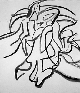 |
| 'Untitled', (Seated woman on bench), 1966 - 1967, Charcoal on Canvas, 28 x 24 in. |
| 'no title', Oil on canvas, 1986, 80 x 70 in. |
- As an aging artist de Kooning would have found it very difficult to let drawing go from his daily habits, it being essential to his make up. Having been throughout his life an adherent of abstract expressionism and 'Automatic' drawing which is supposed to draw from the physical a subconscious response to form and space. It allies the artist very closely with the work physically, cutting off analytical mind functioning somewhat, and relying more upon intuitive or automatic responses to the work in progress. De Kooning relied on his drawing as a basis to his work all through his life. He drew every day (I think from life, even through his abstract work) and the habit of drawing, I think, was very important to his thought process in his work. He relied upon it and during the late work it is the drawing that comes to the fore and out goes the gestural painterliness of earlier work.
De Kooning - Late Works 2

|

| |
| 'Untitled V11' 1985 | 'Untitled' 1987 |
- If we were all to get hold of an encyclopaedia or dictionary and look up the various medical terms for dysfunction and mental illness in society we would probably quickly come to some drastic conclusion as to our own personal mental health and the health of people around us: the whole world is 'mad'!. Through history certain words such as mental, idiot, fool, crazy, nuts etc. have been used in everyday language to express our fears of the encroachment of Mental illness. Recently Psychologists have sought to assuage our fears by analysing mental illness and inventing new more accurate and consumer friendly terms for the various varieties of Mental illness, many of which we suffer from at some time or another at differing levels of intensity, in order to treat it. The old simplistic divisions between 'Madness and civilisation' are still lingering ideas in modern times but lie underneath the multi layers of new terms developed for a more refined view to reflect the complicated nature of the mind. If in doubt though or in moments of rash emotion people still resort to primitive fears, to a time when people with mental illness were cast out of 'civilized' society. Alzheimer's was discovered relatively recently, If de Kooning had been painting in the 19th instead of the 20th Century people would not have recognised his condition and his late work would not have been given the kind of informed support that it does today. Also today it is known that by the age of 85 at least 40% of us will have Alzheimer's, and with a growing older population probably a larger percentage in the future.
De Kooning - Late Works 1

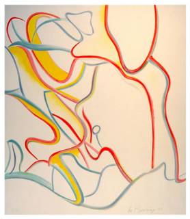
De Kooning 1976
De Kooning 1985
-The following are excerpts relating to the Late works of Willem De Kooning. Those works contrasting so much in style from ealier paintings that they have sparked various debates as to the authenticity of the work. De Kooning suffering from Alzheimers desease during the last ten years of life.
- de Kooning was very much helped by his former wife coming back to live with him during the last ten years of his life and during the onset of Alzheimer's.
She gave order to his day to day life and enabled him to carry on painting while still being able to maintain his memory of earlier works with the aid of constant reference to previous drawings. This may have caused him to rely more heavily on his former drawings and hence the more graphic and less painterly quality to his later work. He used transparencies of early drawings and sometimes laid them over the canvas in order to work directly from them. Elaine de Kooning was important in instructing assistants in the day to day practical matters of preparing canvases and making sure Willem was free to continue his art even through the increasingly difficult circumstances.
Stripping his paintings of the overtly abstract expressionist style reveals the structures that underly his work in more transparent way. However because art critics and collectors had invested heavily in the familiar emotional and expressive language of the earlier work, this work is somehow 'not de Kooning'. The facts are that the work is de Koonings, but de Kooning with Alzheimer's disease. This brings into the equation stereotypes labelled on people with disability and what that means in relation to their art output. De Kooning is one of the few well known artists to have developed a definite disability during his life. This gives us the unique situation where we can analyse the art worlds attitude to disabled artists.
The restriction in his ability to draw upon all of the complexity of skills that he had developed during a long life painting one could see as limiting the work and would accompany a deep sense of loss of a central character in the Abstract expressionist movement and the upsurge of American painting in the 40's and 50's. However I think that quite the opposite is true. The late change in emphasis in de Koonings' work has brought a founder member of the abstract expressionism to the fore again. This new and challenging work, apart from showing a different area of complexity to de Koonings' work, one which brings his work closer to artists such as Brice Marden and his old friend Philip Guston, again, as in the early agenda of abstract artists, deals with issues of conciousness and psychology but in an unexpected way. How conscious was de Kooning of what he was doing? Has that improved or lessened the 'greatness' of his art work or his identity as an artist? How much of creativity includes conscious thought? As in everything is in art the answers are always subjective. -
